

18 Best IT Landing Page Examples in 2025
Imagine you've just launched what you think will be one of your greatest ad campaigns. The targeting is precise, the creative is compelling, and the budget is primed for maximum impact.
Then the data starts rolling in. Clicks are high, but conversions are abysmal. The painful reality? Your landing page is letting you down.
Why? Because in the IT space, you're not just selling a product; you're selling complex solutions that need to resonate with both technical decision-makers who scrutinize your capabilities and business leaders who focus on outcomes and ROI.
Your landing page must thread this needle perfectly – demonstrating technical credibility while communicating clear business value, all in the seconds before a visitor decides to engage or exit.
At Caffeine Marketing, we've seen this disconnect cost IT companies thousands in wasted ad spend and countless missed opportunities. But we've also seen the transformative impact of getting it right. When your landing page speaks the right language to the right audience with the right offer, conversion rates can skyrocket by 5X or more.
What separates high-converting IT landing pages from the rest? We've analyzed hundreds of IT service landing pages to bring you this definitive collection of the best examples in 2025. Each showcases different strengths you can apply to your own conversion strategy.
The Top 18 Best IT Landing Page Examples
- VeilSun
- SMART Group
- The Gnar
- Supabase
- Replit
- Netlify
- Itransition
- GitHub Copilot
- Sentry
- Postman
- Toptal
- X-Team
- Brainhub
- Vercel
- Linear
- Twilio Segment
- Snowflake
- Zapier
1. VeilSun

We love how VeilSun positions itself as a provider of exactly what IT teams need: clear, actionable solutions with results to back them up.
VeilSun's landing page strikes the perfect balance between technical depth and business clarity, immediately establishing credibility with both IT decision-makers and C-suite executives.
We love how their interactive process diagram brilliantly visualizes complex development methodologies without drowning visitors in technical jargon.
Why it's a top IT landing page:
- Benefit-focused headline connects technical capabilities directly to business outcomes
- Interactive process visualization explains methodology without overwhelming non-technical visitors
- Clean, performance-optimized design subtly reinforces their commitment to quality and reliability
2. SMART Group

When you need solutions that solve today’s problems and position you for the future, you want to know that your go-to IT services team is thinking ahead. That’s exactly what SMART Group offers on its IT landing page.
The landing page commands attention with its bold black background and vibrant green accents, instantly communicating a cutting-edge technical approach. Their metrics-focused messaging cuts through complexity to highlight the efficiency gains their solutions deliver.
Why it's a top IT landing page:
- Bold visual identity clearly differentiates from the sea of generic IT service providers
- Streamlined navigation reduces friction and keeps visitors focused on key conversion paths
- Benefit-driven copy translates technical capabilities into tangible business value
3. The Gnar

We are big fans of The Gnar’s style. Not only do they clearly state what they do, but they have fun with it along the way!
The Gnar breaks free from the corporate IT mold with a personality-driven landing page centered on the refreshingly human headline: "We build custom software that humans love to use." Their project showcase features actual application interfaces rather than stock photos, proving both technical prowess and user-centric design philosophy.
Why it's a top IT landing page:
- Distinctive brand personality immediately sets them apart in a crowded market
- User-centric messaging highlights the human impact of their technical solutions
- Real project interfaces showcase actual capabilities instead of abstract promises
4. Supabase

Supabase's landing page makes an audacious promise – "Build in a weekend. Scale to millions" – that immediately captures the attention of ambitious development teams. The asymmetrical headline creates visual interest, while enterprise logos and a live documentation link build instant credibility with technical decision-makers.
Why it's a top IT landing page:
- Bold headline emphasizes speed-to-market and scalability, two critical pain points for IT leaders
- Strategic placement of enterprise logos establishes immediate trust with skeptical prospects
- Live documentation link doubles as both a trust signal and a product demonstration
5. Replit

Replit's landing page instantly engages visitors by embedding an interactive AI coding demo directly in the hero section. This allows users to experience the product's value before committing to sign up. Their "Loved by 40 million" statistic provides immediate social proof, while the dark-mode design resonates with developer preferences.
Why it's a top IT landing page:
- Interactive playground delivers immediate value instead of just making promises
- Compelling user statistics create confidence in the platform's stability and community
- Developer-friendly dark-mode design shows deep understanding of their target audience
6. Netlify

Netlify cuts through complexity with its straightforward promise to "Push your ideas to the web," backed by an impressive display of high-profile client logos. Its three-column "Build / Deploy / Run" structure brilliantly mirrors the developer workflow, making its value proposition instantly digestible.
Why it's a top IT landing page:
- Benefit-focused headline appeals directly to the creative ambitions of their target users
- Workflow-mirroring structure helps visitors immediately understand the platform's value
- Dual CTAs effectively capture both individual developers and enterprise leads
7. Itransition

Itransition leverages its "25+ years" of experience to immediately establish trust with enterprise IT buyers who prioritize stability and proven expertise. Their mega-menu of services doubles as an SEO hub without cluttering the main hero section, while case studies take navigation priority to showcase real results.
Why it's a top IT landing page:
- Longevity-focused messaging directly addresses risk concerns of enterprise decision-makers
- Service mega-menu efficiently communicates breadth of capabilities without overwhelming
- Strategic prioritization of case studies in navigation provides immediate proof of capability
8. GitHub Copilot

GitHub Copilot's landing page brilliantly humanizes AI technology by positioning it as your "AI pair programmer," making sophisticated technology approachable and beneficial rather than threatening. Interactive code previews allow visitors to witness Copilot's capabilities in action before committing.
Why it's a top IT landing page:
- Human-centered messaging transforms complex AI into a relatable, helpful companion
- Interactive code previews demonstrate tangible value in the visitor's actual workflow
- Enterprise trust signals like security certifications address key adoption concerns
9. Sentry

Sentry stands out in the error monitoring space with their memorable, slightly humorous headline: "Your code is broken. Let's fix it together." This approach acknowledges the universal pain point of debugging while positioning itself as a collaborative partner rather than just another tool vendor.
Why it's a top IT landing page:
- Personality-driven headline cuts through the noise of typically bland IT messaging
- Sticky dual CTAs ensure visitors always know their next step, regardless of scroll position
- Compelling usage statistics highlight widespread platform adoption, building immediate trust
10. Postman

Postman's landing page features a dynamic user counter and animated workflow diagram that immediately showcases the platform's popularity and practical capabilities. The copy positions Postman as a "complete API platform," strategically appealing to both hands-on developers and decision-makers seeking comprehensive solutions.
Why it's a top IT landing page:
- Live user counter creates immediate trust and FOMO (fear of missing out)
- Animated workflow visualization clarifies product value without requiring lengthy explanations
- Prominent CTAs with clear value propositions encourage immediate engagement
11. Toptal
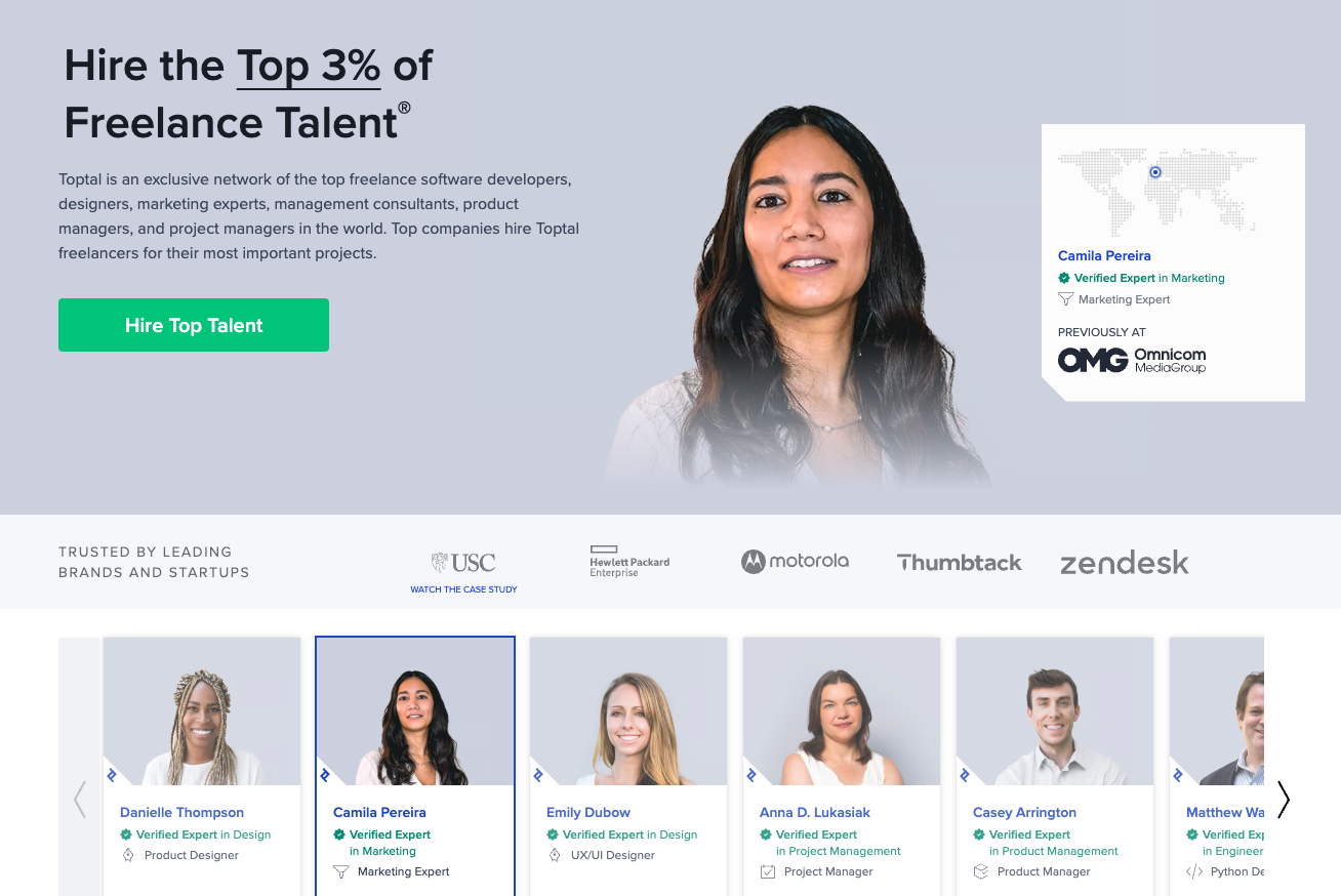
Toptal's landing page is laser-focused on credibility and conversion, immediately highlighting its exclusive network of top-tier tech talent alongside client logos from recognizable global brands. Their streamlined lead capture form significantly reduces friction in the conversion process, while strategic testimonials from recognized companies reinforce trust.
Why it's a top IT landing page:
- Premium positioning attracts high-caliber clients seeking elite technical talent
- Strategic client logos and testimonials provide compelling social proof for skeptical prospects
- Streamlined lead capture form optimizes conversion by removing unnecessary friction
12. X-Team

X-Team's landing page bursts with energy, using bold colors and dynamic illustrations to convey a vibrant community of technical talent rather than just another staffing resource. Their copy emphasizes developer empowerment and innovative remote work culture, appealing to modern tech teams seeking more than just technical skills.
Why it's a top IT landing page:
- Distinctive, energetic branding immediately differentiates from bland IT service providers
- Community and culture-focused messaging addresses the human side of technical partnerships
- Clear CTAs paired with visible social proof create both excitement and confidence
13. Brainhub

Brainhub's landing page projects modern technical expertise through clean design and a strategic focus on technical case studies rather than generic service descriptions. Their messaging is refreshingly concise and benefit-oriented, targeting businesses seeking reliable development partners with proven implementation experience.
Why it's a top IT landing page:
- Modern, expertise-driven design aligns perfectly with their technical service offerings
- Case study emphasis builds credibility through demonstrated results rather than promises
- Concise, benefit-oriented messaging respects visitors' time while delivering key information
14. Vercel

Vercel's landing page immediately positions itself as a complete platform solution with an outcome-focused hero section that addresses visitors' end goals rather than technical features. Their clever use of navigational cards efficiently segments visitors by use case, while prominent customer logos build instant trust.
Why it's a top IT landing page:
- Outcome-focused messaging emphasizes what visitors can achieve, not just what the platform does
- Smart navigation cards efficiently direct different types of users to relevant information
- Strategic placement of customer logos provides immediate credibility with minimal space
15. Linear

Linear's landing page is a masterclass in minimalist design that lets their product take center stage, using conversational headlines and subtle motion elements to demonstrate their tool in action. The copy strikes a perfect balance between technical and approachable, creating an immediate connection with development teams.
Why it's a top IT landing page:
- Conversational copy style creates authentic connection with technical audiences
- Strategic motion elements demonstrate the product in use without distraction
- Minimalist design with clear, repeated CTAs removes decision friction
16. Twilio Segment

Twilio Segment's landing page tackles the intimidating world of data integration with approachable forms and transparent feature descriptions that demystify complex technical processes. Social proof from instantly recognizable clients builds immediate trust, while their clean, modern design and inviting CTA reduce perceived implementation complexity.
Why it's a top IT landing page:
- Approachable, user-friendly design makes technical integration seem accessible
- Transparent feature descriptions eliminate uncertainty about capabilities
- Strategic social proof from major clients validates the platform's enterprise readiness
17. Snowflake

Snowflake's landing page is information-rich yet beautifully organized, positioning the platform as an exclusive, high-value data service for serious enterprise applications. Clear agenda sections and event highlights make it easy for visitors to navigate complex offerings without feeling overwhelmed by technical details.
Why it's a top IT landing page:
- Premium, exclusive positioning appeals to enterprise data leaders
- Strategic organization of dense information prevents cognitive overload
- Professional, enterprise-focused design aligns perfectly with their target audience
18. Zapier

Zapier's landing page excels at communicating complex integration capabilities through crystal-clear messaging about its value as an automation tool for connecting disparate applications. Their user-friendly, approachable design makes technical integrations feel accessible to both developers and non-technical users alike.
Why it's a top IT landing page:
- Value-driven messaging focuses on outcomes rather than technical specifications
- Approachable design makes complex integrations feel accessible to all skill levels
- Prominent, benefit-focused CTA creates clear path to engagement
What Makes a Great IT Landing Page?
After analyzing dozens of high-converting IT landing pages, clear patterns emerge that separate the best from the rest. Let’s break down some of the key ways that you can make sure that your IT landing page stands out from the competition.
1. Trust-Building Technical Credibility
The most effective IT landing pages showcase technical expertise without overwhelming non-technical decision-makers. Visual demonstrations replace jargon-heavy explanations, allowing visitors to grasp complex capabilities quickly. Strategic placement of certifications and partnerships builds credibility without cluttering the page. Interactive elements give prospects a firsthand taste of technical quality, creating an experience rather than just another sales pitch.
Visitors must trust your technical capabilities before considering your business promise. Success comes from demonstrating expertise rather than merely claiming it.
2. Problem-Solution Clarity
High-converting pages start with customer pain points before introducing technical solutions. By translating complex capabilities into clear business outcomes, these pages speak directly to what decision-makers care about most. Thoughtful visual hierarchies guide visitors from recognizing their problem to understanding your unique solution.
The magic happens when visitors instantly connect your offering to their specific challenges. Great IT landing pages create this connection within seconds, eliminating conversion friction at its source.
3. Conversion-Optimized UX
Winning landing pages eliminate every possible barrier in the buyer journey. Minimalist design removes distractions and reduces cognitive load, keeping visitors focused on key messages. Intuitive navigation accommodates varying technical knowledge levels, ensuring no one feels out of their depth.
In the IT space, complexity kills conversion. Simplifying without sacrificing substance creates frictionless pathways to action.
4. Strategic Social Proof
Effective IT landing pages overcome purchase anxiety through powerful social validation. Recognizable client logos positioned near conversion points instantly communicate trustworthiness.
Specific, results-focused testimonials outperform generic praise by showing real-world impact. Quantifiable adoption statistics create FOMO (fear of missing out) that motivates action.
Technical decision-makers approach claims with healthy skepticism. Smart placement of credibility elements addresses this skepticism exactly when doubts typically arise.
5. Action-Driving CTAs
Conversion-focused landing pages feature calls-to-action that create both urgency and clarity. Each CTA offers clear value in exchange for the requested action, making the trade worthwhile.
Benefit-focused button text outperforms generic "Learn More" language by communicating specific value. Multiple CTAs throughout the page capture visitors at different decision stages, maximizing conversion opportunities.
Conversion rates soar when visitors clearly understand both what you want them to do and why they should do it. The best pages make this understanding immediate and compelling.
Your IT Landing Page Should Be On This List
These examples show how high-converting IT landing pages aren't just about flashy designs or clever copy. They're strategic conversion machines built on a deep understanding of both technical capabilities and customer psychology.
What separates the companies on this list from their competitors isn't just what they offer – it's how effectively they communicate that value to their specific audience. Each has mastered the art of speaking to both technical decision-makers and business leaders in a language that resonates with both.
Let’s Supercharge Your IT Landing Page Performance
At Caffeine Marketing, we specialize in helping IT service companies transform underperforming landing pages into lead-generating powerhouses. Our clients typically see conversion improvements of 30-150% within 60 days of implementation.
Is your IT landing page delivering the results your business deserves? Or is it quietly undermining your marketing efforts and draining your ad budget without delivering quality leads?
Schedule a free consultation call today, and we'll analyze your current landing page performance against these best-in-class examples. Then we'll develop a strategic roadmap to elevate your landing page from afterthought to your most powerful lead generation asset.
Your competitors are already optimizing. Don't get left behind.

Meet With A Marketing Strategist
Related Posts


